

The right color palette transforms your living room from ordinary to extraordinary. After five years of helping homeowners redesign their spaces as an interior design consultant, I’ve seen how color choices make or break a room’s entire atmosphere.
Your living room serves as the heart of your home. It’s where families gather, friends visit, and memories form. The colors you choose directly impact how comfortable and welcoming this space feels. Getting it wrong means living with a room that never quite feels right. Getting it right creates a space that perfectly reflects your personality while making everyone feel at home.
Understanding Color Theory Basics

Color theory forms the foundation of every successful design project. During my early career, I learned this lesson the hard way when a client’s living room ended up feeling chaotic because I ignored basic color relationships.
Primary, Secondary, and Tertiary Colors
Primary colors include red, blue, and yellow. These colors cannot be created by mixing other colors together. Secondary colors come from combining two primary colors: green (blue + yellow), orange (red + yellow), and purple (red + blue). Tertiary colors result from mixing a primary and secondary color.
Understanding these relationships helps you create balanced color schemes. When I work with clients, I always start by identifying which primary color family appeals to them most. This becomes our anchor point for the entire palette.
The Color Wheel and Harmonious Combinations
The color wheel shows how colors relate to each other. Complementary colors sit opposite each other on the wheel, like blue and orange. These combinations create high contrast and visual energy. Analogous colors sit next to each other, like blue, blue-green, and green. These create peaceful, harmonious combinations.
Split-complementary schemes use one color plus the two colors adjacent to its complement. This approach gives you contrast without the intensity of true complementary colors. Triadic color schemes use three colors equally spaced on the wheel, creating vibrant yet balanced palettes.
Assessing Your Living Room Space
Before choosing colors, you need to understand your space completely. Room size, natural light, and existing features all influence how colors will look and feel.
Room Size and Proportions
Large living rooms can handle darker, more dramatic colors without feeling cramped. I once worked with a client who had a spacious living room with 12-foot ceilings. We used deep navy blue on the walls with white trim, creating a sophisticated, cozy atmosphere despite the room’s size.
Small living rooms benefit from lighter colors that reflect light and create the illusion of space. However, don’t automatically assume white is your only option. Soft blues, warm grays, and pale greens can make small spaces feel larger while adding personality.
Natural Light Assessment
Natural light changes throughout the day, affecting how your colors appear. North-facing rooms receive cool, consistent light that can make colors appear more muted. South-facing rooms get warm, bright light that intensifies colors. East-facing rooms have cool morning light and warmer afternoon light. West-facing rooms experience the opposite pattern.
I always visit client homes at different times to see how light changes throughout the day. This step prevents unpleasant surprises after the paint goes up.
Existing Architectural Features
Work with your room’s existing features rather than against them. Brick fireplaces, wood trim, built-in shelving, and flooring all influence your color choices. These elements often become part of your palette whether you plan it or not.
Popular Color Palette Styles
Different color approaches create different moods and styles. Here’s what works best for various design preferences.
Neutral Palettes
Neutral color schemes never go out of style because they create timeless, versatile foundations. These palettes use whites, grays, beiges, and browns as their base.
Warm Neutrals vs Cool Neutrals
| Warm Neutrals | Cool Neutrals |
|---|---|
| Beige, cream, warm gray | True gray, white, cool beige |
| Creates cozy, inviting feel | Creates clean, modern look |
| Works well with wood tones | Pairs with metal accents |
| Best in cooler climates | Ideal for warm climates |
Warm neutrals include colors with yellow, red, or brown undertones. These create cozy, traditional atmospheres. Cool neutrals contain blue, green, or purple undertones, creating crisp, contemporary feels.
One client wanted a neutral palette but worried it would look boring. We created depth by using five different shades of warm gray, from pale walls to charcoal accent pillows. The result was sophisticated and calming without being bland.
Monochromatic Schemes
Monochromatic palettes use different shades, tints, and tones of a single color. This approach creates sophisticated, cohesive looks that feel intentional and polished.
The key to successful monochromatic schemes lies in varying the intensity and saturation of your chosen color. Use the lightest version on walls, medium tones for larger furniture pieces, and the darkest shade for accents and accessories.
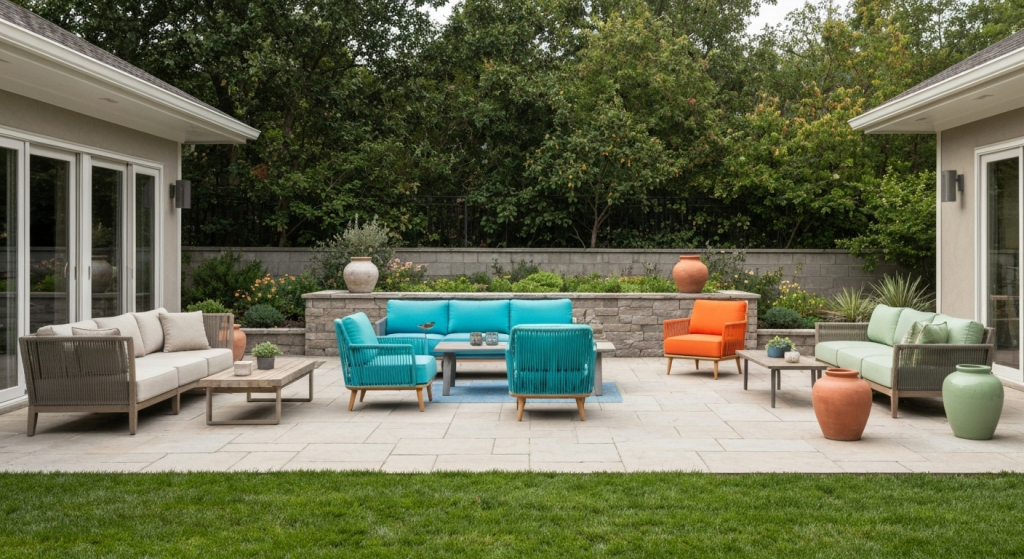
Bold and Vibrant Options
Vibrant color palettes make strong statements and create energetic atmospheres. These schemes work best when balanced carefully to avoid overwhelming the space.
I helped a young couple create a bold living room using teal as the dominant color. We balanced it with cream walls and natural wood furniture. The result was striking but still livable for daily use.
Earth Tone Palettes
Earth tones connect your interior to the natural world. These colors include terracotta, sage green, warm browns, and dusty blues. Earth tone palettes create grounding, peaceful environments that feel both current and timeless.
Considering Your Lifestyle and Preferences
Your color choices should reflect how you actually live in your space. Consider who uses the room and for what purposes.
Family-Friendly Colors
Families with young children need practical color choices. Darker colors hide stains and wear better than light ones. Medium-toned colors offer the best balance between practicality and style.
Avoid pure white walls if you have children. Instead, choose warm off-whites or light grays that won’t show every fingerprint and scuff mark.
Entertaining and Relaxation Needs
If you frequently entertain, choose colors that create welcoming atmospheres for guests. Warm colors like soft reds, oranges, and yellows encourage conversation and social interaction.
For relaxation-focused living rooms, cooler colors like blues and greens promote calm and rest. These work especially well in homes where the living room doubles as a quiet retreat space.
Personal Style Reflection
Your color palette should feel authentically you. Don’t choose trendy colors just because they’re popular if they don’t resonate with your personality.
I worked with a client who loved purple but feared it was too bold. We created a beautiful palette using lavender walls with deeper purple accents. The room felt perfectly suited to her personality while remaining sophisticated.
Technical Color Selection Methods
Choosing colors involves more than just picking pretty shades. These methods help ensure your palette works together harmoniously.
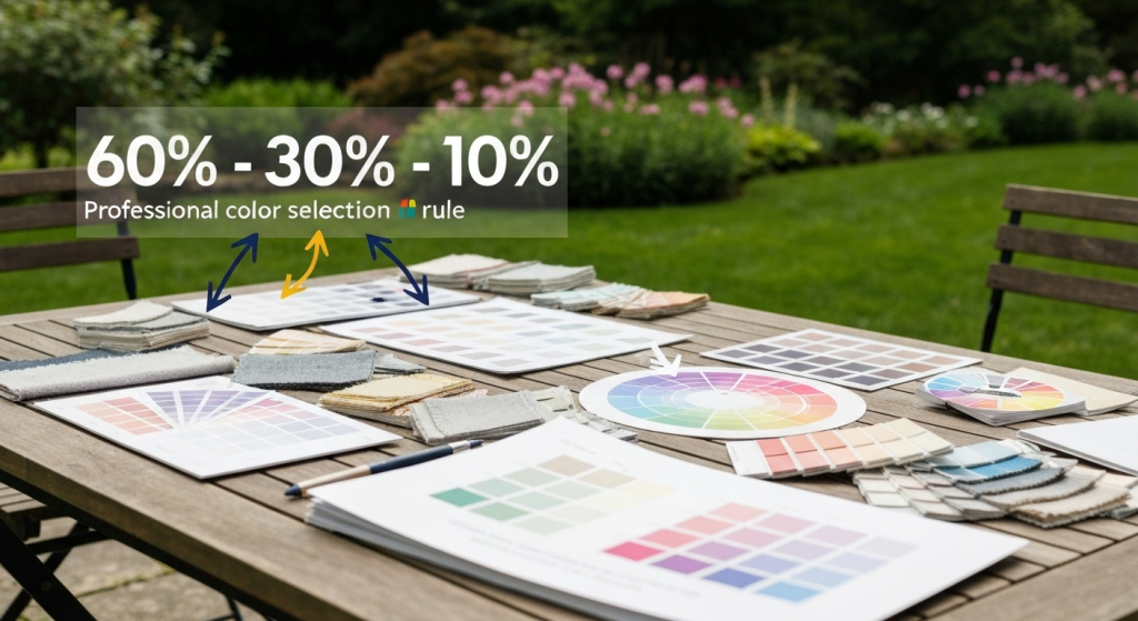
The 60-30-10 Rule
This classic design rule creates balanced color distribution throughout your space. Use your dominant color for 60% of the room (usually walls), a secondary color for 30% (larger furniture pieces), and a bold accent color for 10% (accessories and artwork).
60-30-10 Rule Application:
- 60%: Wall color, large area rugs
- 30%: Upholstery, curtains, major furniture
- 10%: Pillows, artwork, decorative objects
This rule prevents any single color from overwhelming the space while ensuring adequate visual interest.
Creating Color Flow Between Rooms
Your living room shouldn’t exist in isolation from the rest of your home. Create visual connection by repeating elements of your living room palette in adjacent spaces.
Use the same neutral base throughout your main floor, then vary accent colors from room to room. This approach creates cohesion while allowing each space to have its own personality.
Seasonal Color Adaptability
Choose a base palette that works year-round, then swap accessories to reflect seasonal changes. Neutral walls with changeable pillows, throws, and artwork let you refresh your look without major renovations.
Lighting and Color Interaction
Lighting dramatically affects how colors appear in your space. Understanding this relationship prevents disappointing results.
Natural vs Artificial Light Effects
Natural daylight shows colors most accurately. Incandescent bulbs add warm yellow tones to colors. LED and fluorescent lights can add cool blue tones. This means your carefully chosen paint color might look completely different at night under artificial lighting.
Always test paint colors under both natural and artificial light before making final decisions. Paint large swat