
Gallery walls create stunning focal points that showcase personality and style in any living space. After five years of designing custom gallery walls for clients across residential and commercial projects, I’ve learned that successful picture arrangements require careful planning, proper spacing, and strategic placement techniques.
My name is Richard Boren, and I’ve been helping homeowners and interior designers create impactful gallery walls since 2020. Through hundreds of installations, I’ve discovered the exact formulas that make gallery walls work beautifully in bedrooms, living rooms, hallways, and offices. This comprehensive guide shares proven strategies, common mistakes to avoid, and step-by-step layout methods that guarantee professional results.
What Makes Gallery Walls So Effective
Gallery walls serve multiple purposes beyond simple decoration. They fill large empty spaces, create visual interest, and tell personal stories through curated artwork and photographs. The key lies in understanding how different layouts affect room dynamics and choosing arrangements that complement existing furniture and architecture.
During my early projects, I noticed clients often struggled with spacing and proportion. A gallery wall that looks perfect on Pinterest might fail completely in their actual room. The difference comes down to understanding scale, visual weight, and how the human eye processes grouped elements.
Gallery walls work because they create intentional focal points. Instead of scattered single frames that compete for attention, grouped arrangements guide the viewer’s eye through a cohesive visual journey. This principle applies whether you’re working with family photos, abstract art, or mixed media collections.
Essential Planning Steps Before You Start
Measure Your Wall Space Accurately
Start by measuring the exact wall dimensions where your gallery will hang. Note any obstacles like light switches, outlets, or furniture that might affect placement. I always create a simple floor plan sketch showing these elements before selecting artwork sizes.
Choose Your Gallery Wall Style
Three main gallery wall styles dominate interior design:
- Grid layouts use identical frame sizes arranged in perfect rows and columns
- Salon-style arrangements mix different frame sizes and artwork types organically
- Themed collections focus on specific subjects, colors, or artistic styles
Gather Your Artwork Collection
Collect all potential pieces before planning your layout. Include family photos, artwork, mirrors, small shelves, and decorative objects. Lay everything on the floor to visualize how pieces work together. This process often reveals natural groupings and color connections you hadn’t noticed.
Layout TypeBest ForDifficulty LevelTime RequiredGrid GalleryBeginners, formal spacesEasy2-3 hoursSalon StyleExperienced decoratorsAdvanced4-6 hoursLinear ArrangementHallways, staircasesModerate1-2 hours
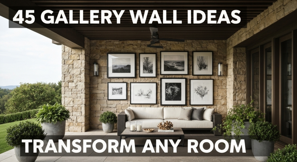
Living Room Gallery Wall Layouts
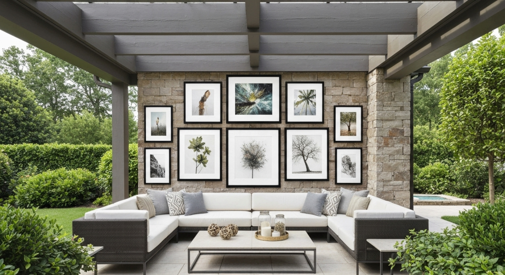
Above the Sofa Arrangements
The space above your sofa offers prime gallery wall real estate. The standard rule calls for artwork to span 50-75% of the sofa’s width, but I’ve found that slightly wider arrangements often look more balanced.
Start by marking the sofa’s center point on the wall. Your gallery wall’s center should align with this point, creating visual harmony between furniture and artwork. Leave 6-8 inches between the sofa back and the lowest hanging piece.
Corner Gallery Solutions
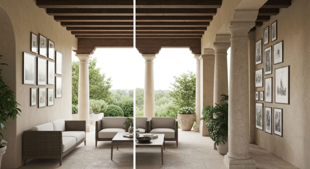
Corner spaces often get overlooked, but they’re perfect for smaller gallery arrangements. I use corner galleries to connect two walls visually and create cozy reading nooks or conversation areas. Choose 3-5 pieces in similar tones and arrange them in an L-shape following the corner’s natural lines.
Fireplace Mantel Combinations
Fireplaces present unique challenges because the mantel creates a natural shelf for decorative objects. Balance wall-mounted artwork with mantel displays by choosing pieces that complement rather than compete. Keep gallery walls above fireplaces slightly smaller than you might initially think – the mantel already provides visual weight.
Bedroom Gallery Wall Ideas
Above the Headboard
Bedroom gallery walls should create calm, restful atmospheres. I avoid busy arrangements or high-contrast color schemes that might feel energizing rather than soothing. Choose artwork in soft tones that complement your bedding and window treatments.
Position the gallery wall center about 12-18 inches above a standard headboard. This height ensures the arrangement feels connected to the bed without overwhelming the sleeping space. Keep individual pieces relatively small – oversized artwork can feel oppressive in bedrooms.
Dresser and Vanity Areas
Gallery walls above dressers work best when they mirror the furniture’s proportions. If your dresser spans 48 inches, plan a gallery wall that’s roughly 36-42 inches wide. This creates pleasing visual relationships between horizontal and vertical elements.
Consider the dresser’s daily use when planning your layout. Leave enough clearance for table lamps, jewelry boxes, or other essentials. Gallery walls in these areas should enhance functionality rather than complicate it.
Hallway and Staircase Arrangements
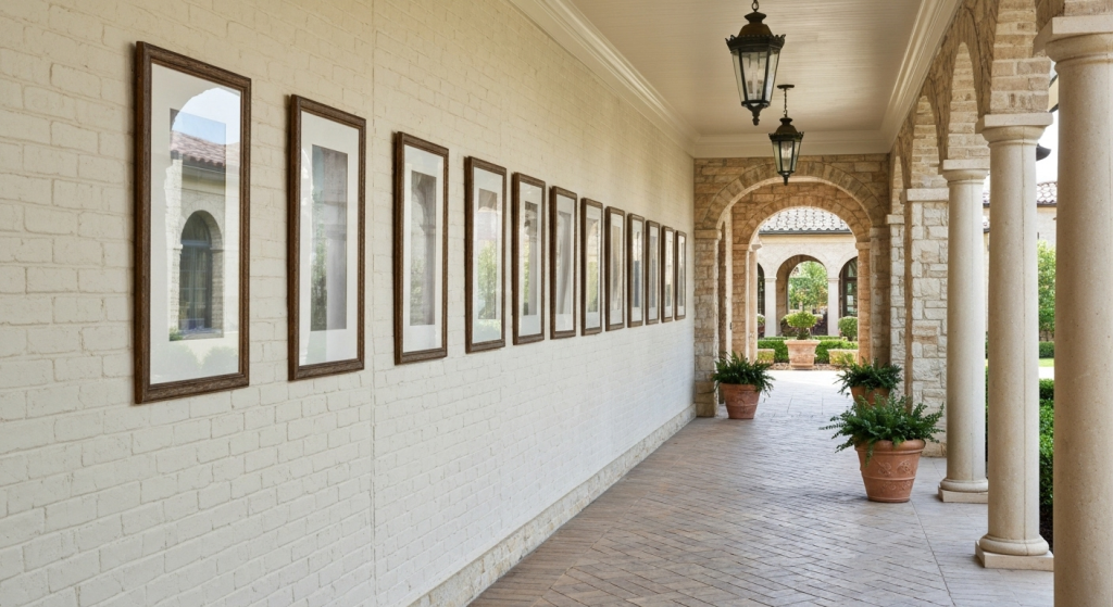
Linear Gallery Walls
Hallways call for linear arrangements that guide movement through the space. I typically use 3-7 pieces arranged in a straight line, maintaining consistent spacing between frames. The key is keeping everything at a uniform height – usually 57-60 inches to the center of each frame.
Staircase Gallery Progressions
Staircase galleries follow the stair’s natural angle, creating dynamic ascending arrangements. Start with your largest piece at the bottom and gradually decrease sizes as you move upward. This technique draws the eye naturally along the stair’s progression.
Maintain consistent spacing between frames – typically 2-3 inches – and ensure each piece hangs at the same angle relative to the stair steps. This creates professional-looking progressions that feel intentional rather than haphazard.
Small Space Gallery Solutions
Apartment and Condo Strategies
Small spaces benefit from gallery walls that add personality without overwhelming limited square footage. Choose lighter frame colors and matte finishes that reflect light rather than absorbing it. White, cream, and light wood frames work particularly well in compact rooms.
Focus on vertical arrangements that draw the eye upward, making ceilings appear higher. Three pieces stacked vertically often work better than five pieces arranged horizontally in tight spaces.
Bathroom Gallery Walls
Bathrooms require special consideration for humidity and moisture. Use sealed frames with proper backing, and avoid paper-based artwork that might warp over time. Photography prints on metal or canvas work particularly well in these environments.
Keep bathroom galleries simple – 2-4 pieces maximum. The space’s functional nature means artwork should complement rather than dominate the room’s primary purpose.
Professional Hanging Techniques
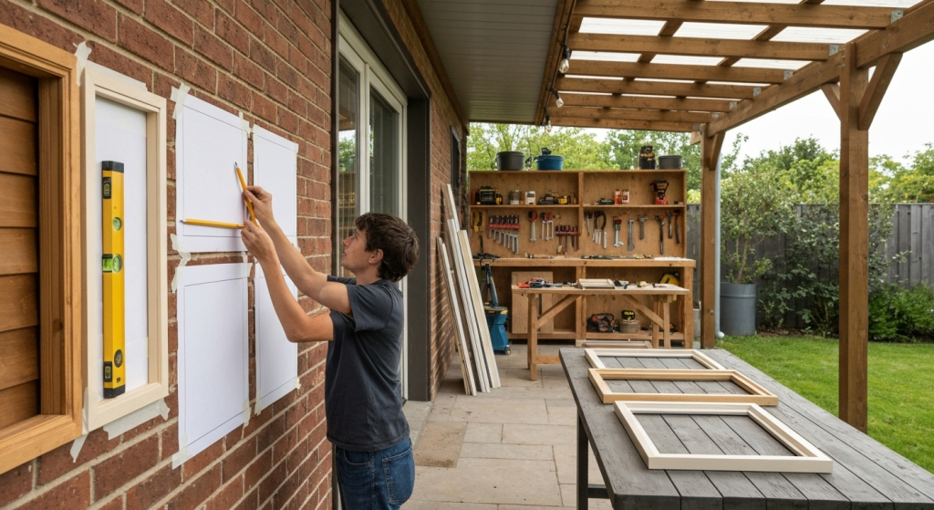
The Paper Template Method
Cut paper templates matching each frame’s dimensions and tape them to the wall before hanging anything permanently. This allows you to adjust spacing and positioning without creating multiple nail holes. I use this technique for every gallery wall installation.
Mark the center point of each template, then measure and mark corresponding points on your actual frames. This system ensures accurate placement and reduces costly mistakes.
Proper Spacing Guidelines
Consistent spacing creates professional-looking gallery walls. I typically use 2-3 inches between frames for most arrangements, though this can vary based on frame sizes and overall wall dimensions. Larger spaces can accommodate slightly wider gaps, while smaller walls benefit from tighter spacing.
Height and Eye Level Considerations
The standard gallery wall height centers artwork at 57-60 inches from the floor – roughly average eye level for most adults. However, consider your family’s height and how the space gets used. Gallery walls in children’s rooms might hang slightly lower, while formal dining areas might benefit from slightly higher placement.
Room TypeRecommended HeightSpacing Between FramesMaximum Number of PiecesLiving Room57-60 inches2-3 inches5-9 piecesBedroom54-57 inches2-4 inches3-7 piecesHallway60 inches2-3 inches3-5 piecesBathroom54-57 inches1-2 inches2-4 pieces
Common Gallery Wall Mistakes to Avoid
Hanging Everything Too High
The most common mistake I see is hanging gallery walls too high on the wall. When artwork hangs above eye level, it loses visual connection with the room’s occupants and furniture. Always step back and evaluate height from multiple viewing angles before finalizing placement.
Ignoring Furniture Relationships
Gallery walls should relate to nearby furniture pieces. A tiny gallery wall above a large sectional sofa looks lost, while an oversized arrangement above a small accent table feels overwhelming. Consider the visual weight and scale of surrounding elements when planning your layout.
Using Inconsistent Frame Styles
While mixing frame materials can create interesting gallery walls, avoid combining too many different styles in one arrangement. Stick to 2-3 frame types maximum, and ensure they share common elements like color, finish, or proportions.
Forgetting About Lighting
Poor lighting kills even the most carefully planned gallery walls. Ensure your arrangement receives adequate illumination throughout the day. Consider adding picture lights or adjusting existing fixtures to highlight your artwork effectively.
Advanced Layout Techniques
Creating Visual Balance
Visual balance doesn’t require symmetry, but it does demand careful weight distribution. Place your heaviest visual elements – typically the largest or darkest pieces – strategically throughout the arrangement rather than clustering them in one area.
I often use the “triangle rule” for complex gallery walls, ensuring that similar visual weights form invisible triangular patterns across the arrangement. This creates dynamic balance that feels natural rather than forced.
Color Coordination Strategies
Color relationships make or break gallery wall success. I typically choose one dominant color that appears in 60% of the pieces, a secondary color for 30%, and an accent color for the remaining 10%. This formula creates cohesive arrangements that don’t feel overly matched or boring.
Incorporating Three-Dimensional Elements
Flat artwork doesn’t have to dominate your gallery wall. Small shelves, decorative mirrors, or sculptural elements add depth and interest to two-dimensional arrangements. Keep three-dimensional pieces to 20-30% of your total collection to maintain visual balance.
Frequently Asked Questions
How many pieces should I include in a gallery wall?
Most successful gallery walls contain 3-9 pieces. Fewer than three pieces doesn’t create enough visual impact, while more than nine can feel cluttered. Start with 5-7 pieces for your first gallery wall – it’s easier to add pieces later than to remove them.
What’s the best way to mix frame sizes?
Use odd numbers of frame sizes and stick to 2-3 different dimensions. For example, combine three 8×10 frames, two 11×14 frames, and one 16×20 frame. This creates interesting variety without becoming chaotic.
Should all frames match exactly?
Frames don’t need to match perfectly, but they should share common elements. Mix different sizes of the same frame style, or combine different styles in the same color family. Avoid mixing more than three distinct frame types in one arrangement.
How do I hang heavy pieces safely?
Use appropriate wall anchors rated for your artwork’s weight. Drywall anchors work for pieces under 20 pounds, while heavier items require wall studs or toggle bolts. When in doubt, consult a professional – damaged walls cost more than proper installation.
Conclusion
Gallery walls transform ordinary rooms into personalized spaces that reflect individual style and personality. The key lies in careful planning, proper proportions, and understanding how different layouts affect room dynamics.
Start with simple arrangements and build confidence through practice. Remember that gallery walls can evolve over time – add new pieces, rearrange existing elements, or completely redesign layouts as your taste develops.
Focus on creating arrangements that serve your daily life rather than just looking good in photos. The best gallery walls enhance how you experience and enjoy your living spaces, creating daily moments of visual pleasure and personal connection.
With these professional techniques and layout strategies, you’re equipped to create stunning gallery walls that elevate any room in your home. Take your time with the planning process, invest in quality hanging hardware, and don’t be afraid to experiment with different arrangements until you find the perfect solution for your space.